
Context
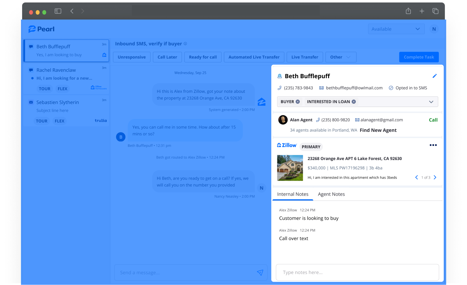
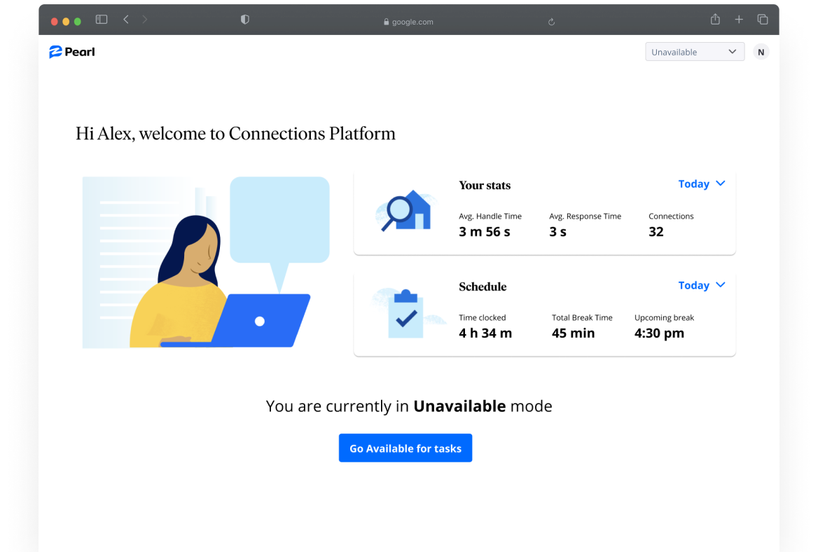
Our Connections Specialists (reps) play a key role in being the crucial connector between customers and our business partners. Pearl is the communication tool for connections specialists use to handle requests from potential home buyers/sellers and capture necessary information from them in order to match them to an appropriate agent or loan officer.
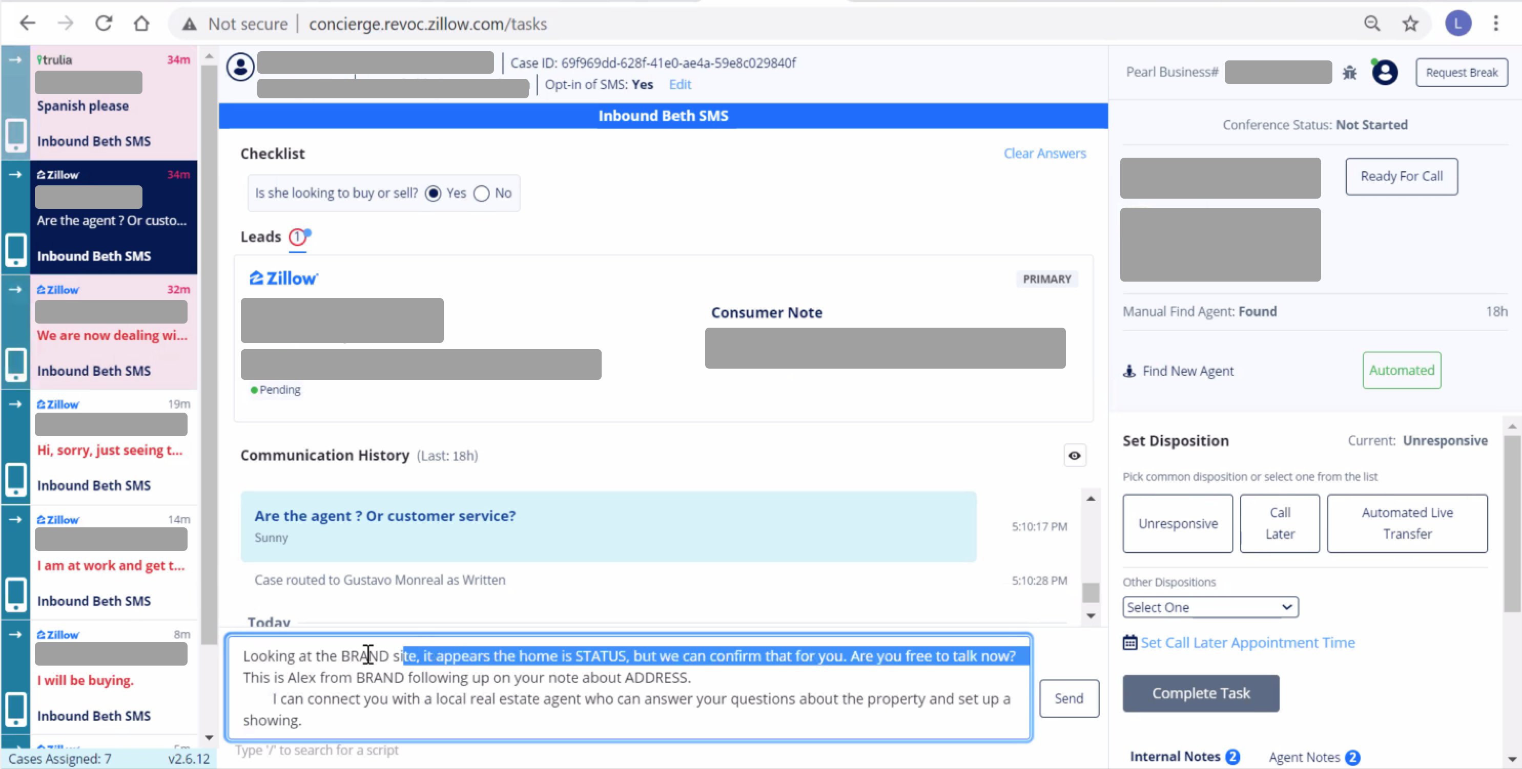
Pearl was built in 2018 to support connections specialists with their operational needs. A lot of features and complexity were added over the past years to meet business needs and compliance, but they were implemented over time without a design system haphazardly. The platform has come to a point where it's negatively affecting our connections specialist's experience and productivity.
The opportunity
The scope of the project was initially tasked out as a UI migration to our Constellation, our new design system. However, I saw this as an opportunity to take it one step forward.
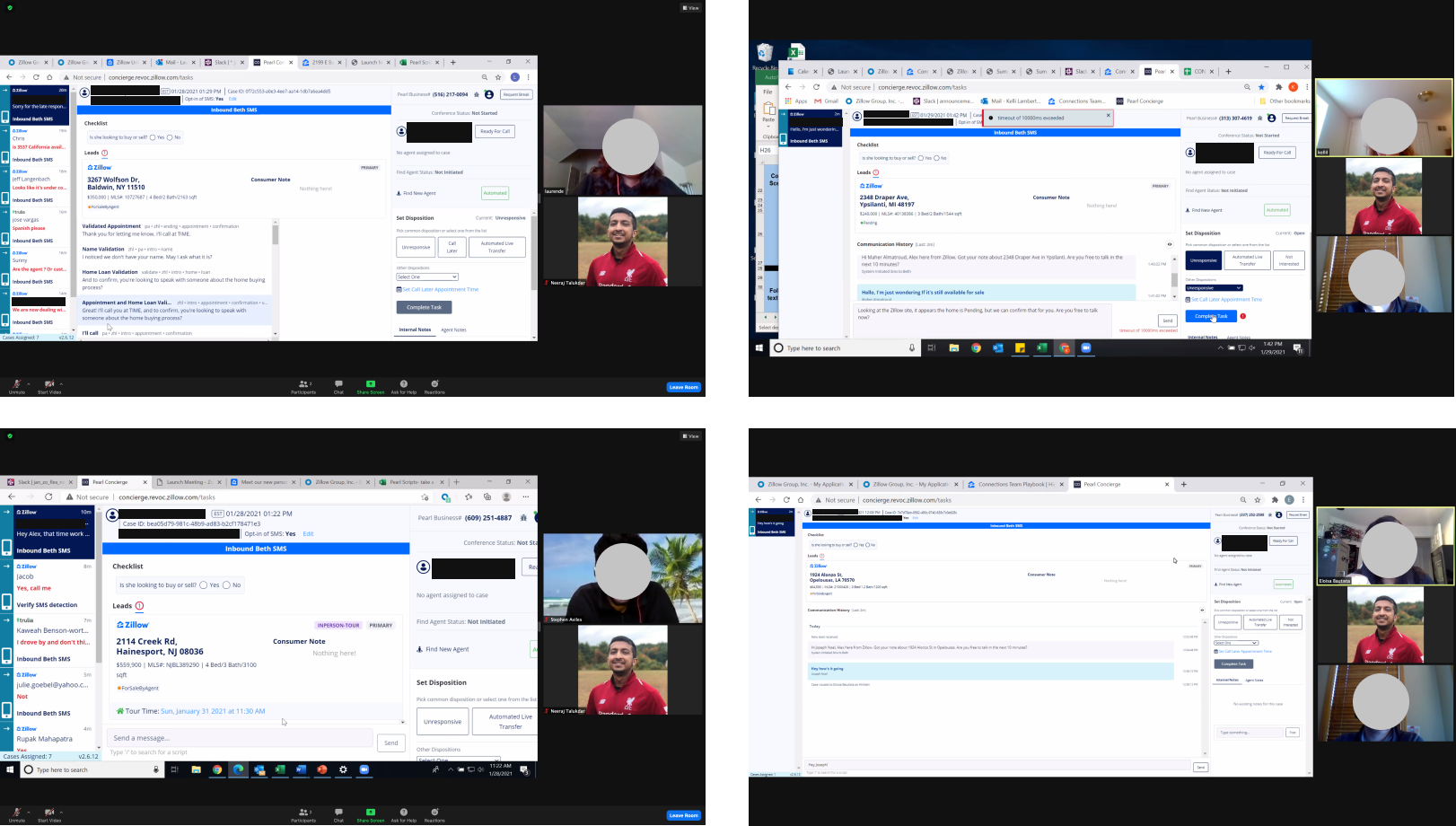
I set up shadow sessions with our reps which was followed up by interviews to get an understanding of their current workflow and the pain-points with the existing tool. This helped me get a better understanding of the way they work day-to-day. I also did a heuristic evaluation of the tool to build the case for a re-design of the overall experience rather than just a design system update.
A few key takeaways:
- Customer details are spanning across multiple disjointed sections
- The communication section in the middle is difficult to use due to current layout constraints
- Lot of redundancies in the overall layout of information
- Lots of back and forth for agents to complete a task between multiple tabs
- Content has a lot of scope for enhancement such as error messages and help text
- Overall accessibility and usability issues
Defining a new framework for the platform
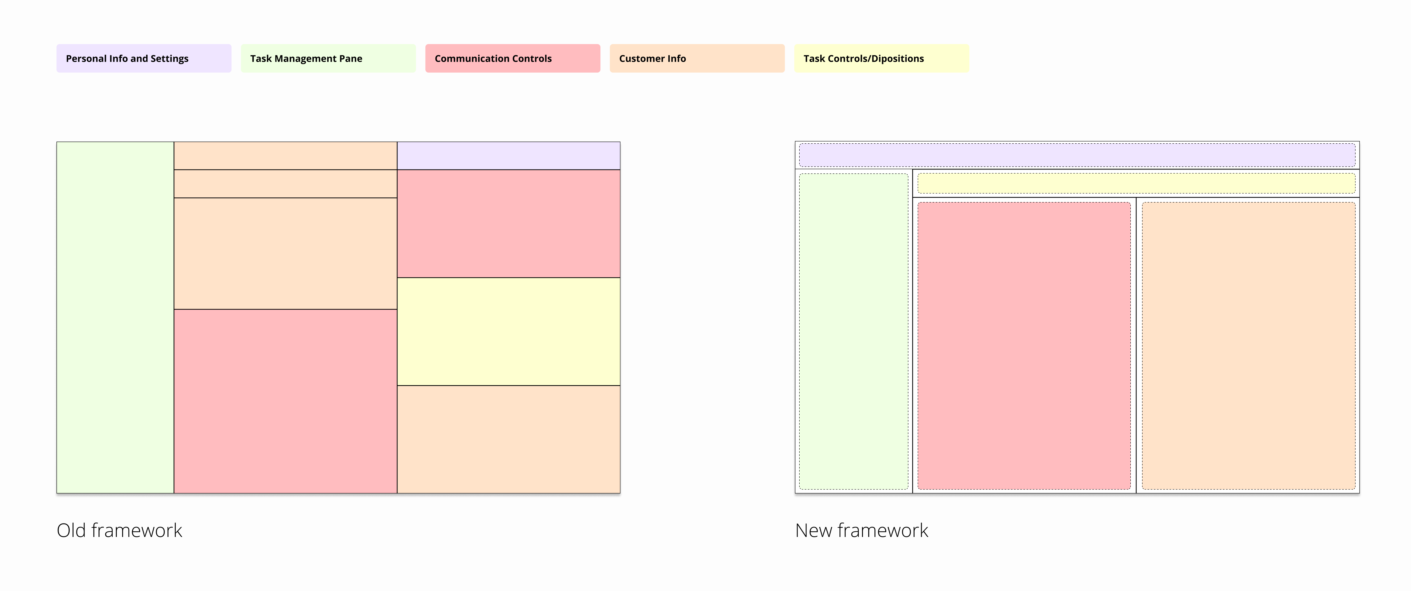
The research showed that we needed a more systematic approach to categorize information and design the working areas. Therefore, I first focused on getting the framework right with a series of layout iterations led by use cases and task flows. We concluded on the final framework with considerations such as aligning with Zillow's other platforms and guidelines, streamlining core task flows and supporting scalability for the platform.
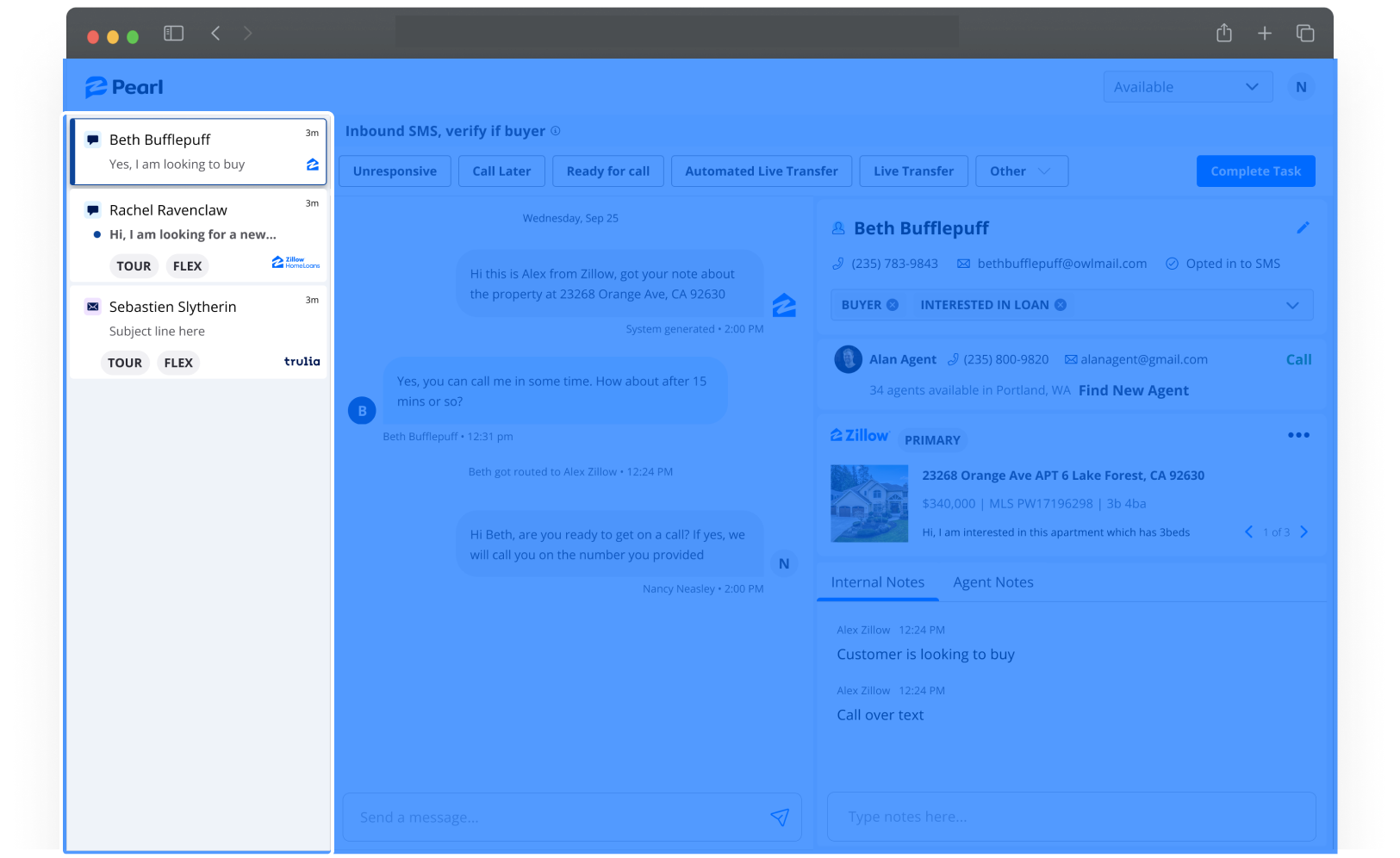
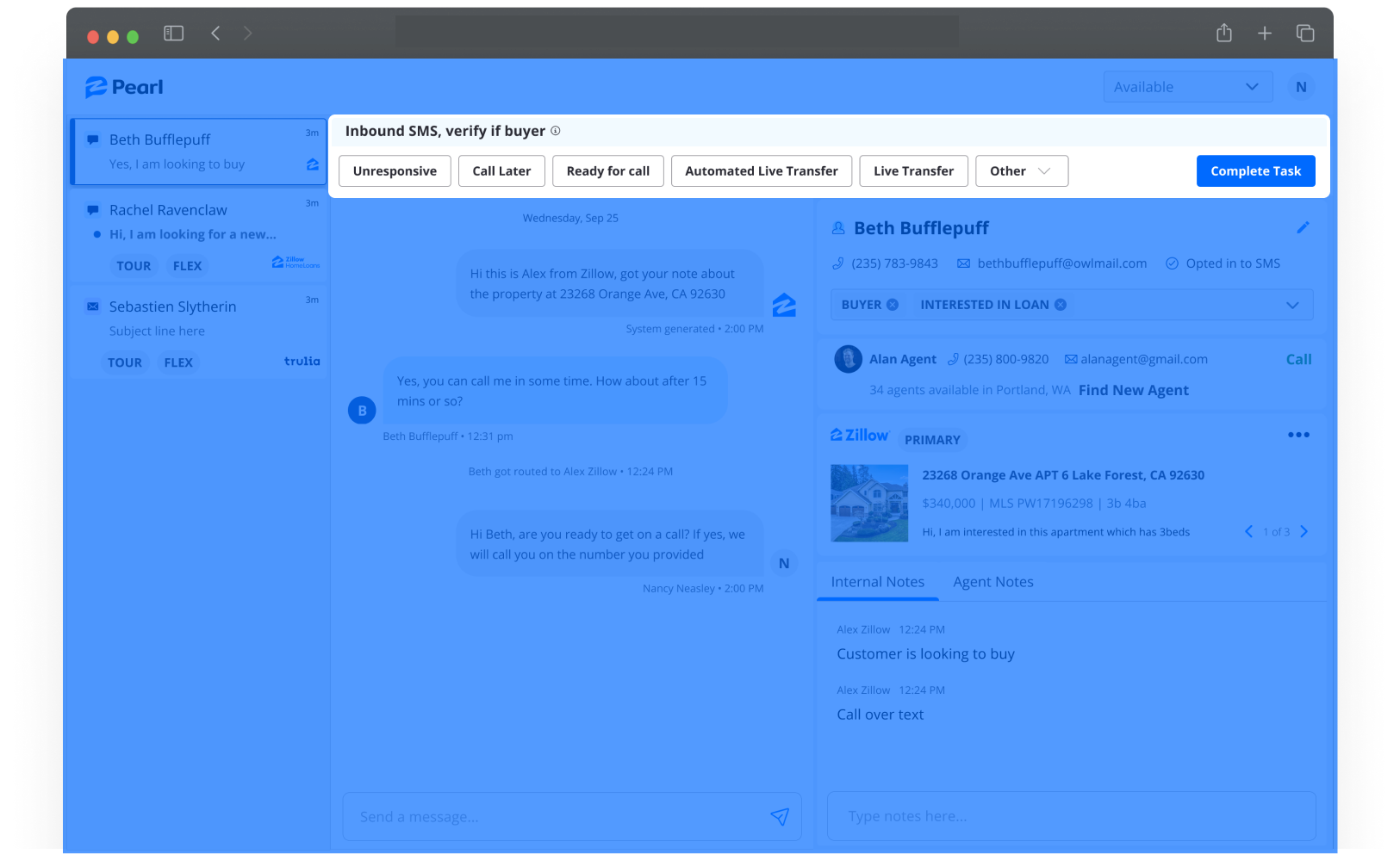
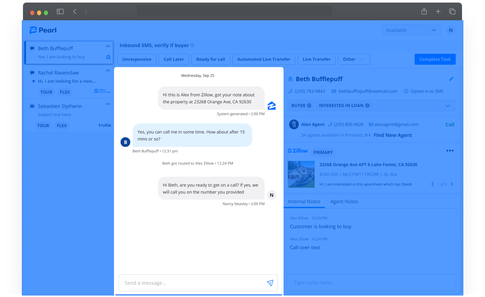
The framework we landed on has a navigation bar at the top, following by a task list from the left, a task control bar at the top, the communication section in the middle and secondary information in which we called customer information section at the right.
Building out the individual components
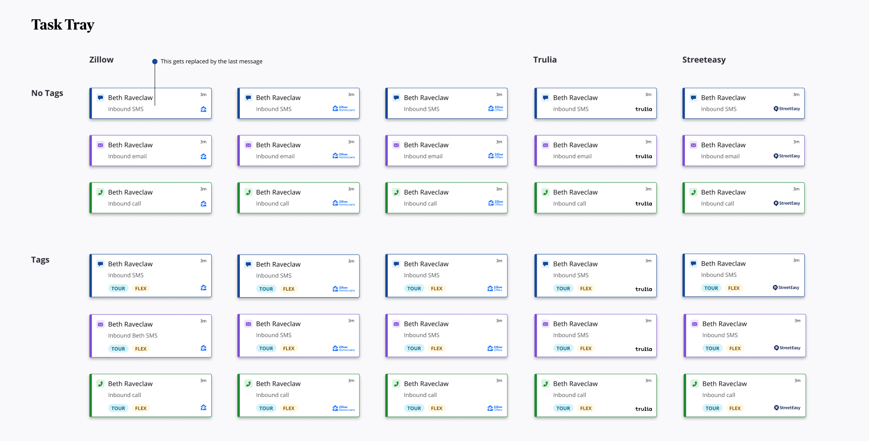
Once the framework was established, I worked closely with the design system team to align on the needs of new components and to detail out design components and specs. As part of the detailed design effort I delivered all the variations and states to support the engineering teams throughout the process.